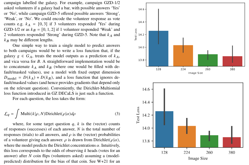
Figures look best when they match the style of the document. How can you make matplotlib figures that match the style of journal paper?
I mostly publish in MNRAS, so I’ll use that as an example, but this approach should work for any latex paper format (ApJ, NeurIPS, etc.).
There’s two parts that need adjusting:
- graphics elements: primarily figure size, which affects line widths, tick spacing, etc.
- text: primarily the font and size.

Graphics Elements
The first and most important step is setting the right figure size. Everything else follows.
The default matplotlib figure size is 6.4 by 4.8 inches. To fit in a two column paper format, figures need to be about half that default size. I used to resize the final figure image with [width=\columnwidth]. But this makes everything proportionally smaller - the text, the line widths, etc. I think this is why a lot of student reports (including mine) have borderline-unreadable figures.
Instead, make the figure the correct size in the first place. You can do this by trial and error, but it’s easiest if you know the actual width required. You can check this in LaTeX with \the\columnwidth (StackOverflow).
For MNRAS, the column width is 240 points (pt). 1pt is 1/72 of an inch, so the column width is exactly 10/3 inches. Set every figure 10/3 inches wide and they will fit perfectly into the MNRAS columns.
fig, ax = plt.subplots(figsize=(10/3, 3))  # height can be anything
ax.plot(...)
fig.tight_layout()
Matplotlib and Seaborn both have sensible defaults for the size of graphics elements provided you set the figure the same size that it will appear on the page. If you want to tinker further, check out sns.set_context and sns.set.
Text
Figure text looks professional when it is the same font and of a similar size to the body text.
Sizing
If we resize the figure to make it fit in a column ([width=\columnwidth]) then the text will also be resized. So it’s crucial to get the figure size right first. Check the section above.
Got that done? Good. Now let’s set the font size.
You can check the font size of the body text using the following LaTeX command:
\documentclass{article}

\makeatletter
\newcommand\thefontsize[1]{{#1 The current font size is: \f@size pt\par}}
\makeatother

\begin{document}
    \thefontsize\small
    \thefontsize\normalsize
    \thefontsize\large
\end{document}
This is also measured in points (pt). For MNRAS, \normalsize text is 9pt.
Now set matplotlib to make text in that size. You can use the fontsize argument with most matplotlib commands e.g. ax.set_xlabel(..., fontsize=9).
I like to make my figures in a dedicated Jupyter notebook with Matplotlib’s global text parameters set in a cell at the top at the top.
# in points - start with the body text size and play around
SMALL_SIZE = 9
MEDIUM_SIZE = 9
BIGGER_SIZE = 9

plt.rc('font', size=SMALL_SIZE)          # controls default text sizes
plt.rc('axes', titlesize=SMALL_SIZE)     # fontsize of the axes title
plt.rc('axes', labelsize=MEDIUM_SIZE)    # fontsize of the x and y labels
plt.rc('xtick', labelsize=SMALL_SIZE)    # fontsize of the tick labels
plt.rc('ytick', labelsize=SMALL_SIZE)    # fontsize of the tick labels
plt.rc('legend', fontsize=SMALL_SIZE)    # legend fontsize
plt.rc('figure', titlesize=BIGGER_SIZE)
There’s no need for the size to match exactly. I find slightly larger axes labels look good.But now the text sizing will be deliberately chosen and consistent for all your figures.
Before tinkering with the sizing, remember to match the font (below).
Fonts
Seaborn and Matplotlib use minimalist fonts, while journals tend to use fonts that look more serious and typewriter-esque. Changing the figures to use the serious journal font will help keep a consistent visual style. It will also help you precisely match the sizing (above) as different fonts can look different sizes even if they are technically the same points.
LaTeX sets fonts via \usepackage{} in the main document (not in the style file, confusingly) so take a look at which packages your document uses to find the font. This may require some sleuthing.
MNRAS uses \usepackage{newtxtext} which is part of newtx. The LaTeX Font Catalog lists newtx as using “URW Nimbus Roman”. We can check a sample on fontsquirrel.
Matplotlib can only use fonts which are installed on your computer. Download URW Nimbus Roman (.otf file) from fontsquirrel. Installing fonts is different for different OS, so you might need to google what to do next. For me, on CentOS, I placed the .otf in the new folder /home/{user}/.fonts and ran fc-cache -v to check for new fonts.
Now check the font is installed correctly. This command will list the install location of every font. You should see the path to your new .otf file, if you installed it.
import matplotlib.font_manager
matplotlib.font_manager.findSystemFonts(fontpaths=None, fontext='ttf')
Finally, we’re ready to set matplotlib to use that font. We need to find what the font is called, using a similar command:
fpaths = matplotlib.font_manager.findSystemFonts()

for i in fpaths:
    f = matplotlib.font_manager.get_font(i)
    print(f.family_name)
Now we can set matplotlib to use that font with plt.rc in just the same way as setting the text size.
plt.rc('font', family='Nimbus Roman')Your figures should now have the same font and text size as the journal body text.
Now all you have to do is write the paper…